
BRISTOL AQUARISTS' SOCIETY
IMPROVE READABILITY

| Home |
|
BRISTOL AQUARISTS' SOCIETYIMPROVE READABILITY |
|
Here are two easy steps you can take to improve the readability of text on-screen.
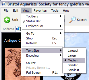
In Internet Explorer, the default font size is Medium, as shown below. You can change this to make the on-screen text size larger or smaller (click on View... Text Size... Larger/Largest or Smaller/Smallest), and any change you make will remain in force for all websites you visit.
In Netscape Navigator, click on View... Increase Font or Decrease Font.
If you have Windows 98, ME, 2000 or XP, you can take a further step. Letters have an untidy edge on-screen, using the Windows default setting, as shown below:
![]()
You can smooth the edges of the letters, as shown in the improvement below:
![]()
Right-click on the Windows Desktop and, on the menu box that appears, click on Properties. This will bring up the Display Properties window as shown below:
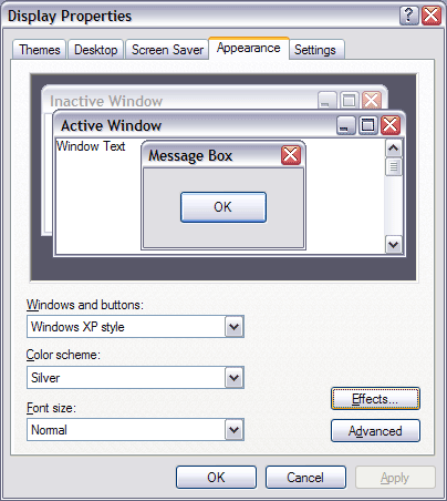
In XP, click on the Appearance tab at the top, then click on the Effects... button, and the Effects window will appear, as shown below:
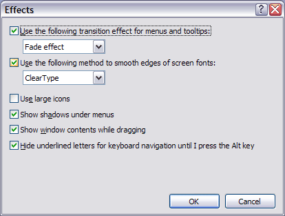
Put a tick in the box for Smooth Edges of Screen Fonts (and try either Standard or ClearType from the drop-down list). Click OK, then click OK again.
In Windows 98, there is a separate Effects tab at the top of the Display Properties window; put a tick against Smooth Edges of Screen Fonts, then click OK.